Dokan Multi Vendor Plugin: Vendor Panel Design Is Stuck in the Past
-
This company focus on their Cloud version
https://dokan.co/app/uploads/2024/10/simplifying-the-ecommerce-journey-for-all-1024×761.png
Investing this plugin will be greatest mistake I think. Just comparing their vendor dashkbaords explains everything.
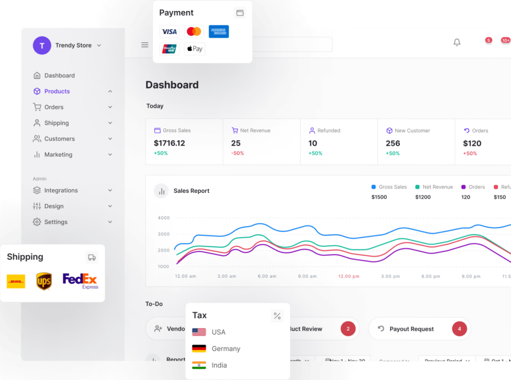
Dokan Multi Vendor Plugin: Vendor Panel Design Is Stuck in the Past
As someone who’s worked extensively with WordPress and WooCommerce ecosystems, I’ve had my fair share of experience with multi-vendor solutions. Dokan, despite its popularity and long-standing presence, continues to disappoint in one glaring area: the vendor panel design.
🎨 A UI That Time Forgot
The vendor dashboard feels like it was designed in 2000 and then left to gather dust. It’s clunky, visually uninspired, and lacks the intuitive UX that modern vendors expect. Even basic layout decisions—like navigation hierarchy, spacing, and responsiveness—feel like afterthoughts. For a plugin that positions itself as a premium multi-vendor solution, this is unacceptable.- No design evolution: Year after year, the vendor panel remains virtually unchanged.
- Poor UX decisions: Important actions are buried, while trivial stats are front and center.
- Lack of customization: Vendors have little control over layout or branding, which is a missed opportunity for marketplaces trying to differentiate.
⚙️ A Sign of Deeper Issues?
While Dokan has made strides in performance and compatibility with newer tech stacks, the stagnant vendor panel design raises a red flag. If the team isn’t investing in the most visible part of the vendor experience, what does that say about their long-term priorities? - Is design a low priority? It seems so, given the years of neglect.
- Is vendor experience undervalued? Possibly—especially when admin features get more attention.
- Is the plugin bloated with features but thin on polish? That’s the impression.
🧪 Final Thoughts
Dokan’s vendor panel is not just outdated—it’s a liability. It undermines the credibility of marketplaces built on it and frustrates vendors who expect a modern, efficient interface. If you’re evaluating multi-vendor plugins, this design stagnation should be a serious consideration. A plugin that ignores UI/UX for years may be signaling deeper complacency.
The topic ‘Dokan Multi Vendor Plugin: Vendor Panel Design Is Stuck in the Past’ is closed to new replies.