Format in mobile site
-
The calculator works great in full screen mode (apart from buttons not quite being aligned despite being in DIV/Fieldset).
However, when switching to tablet/mobile view, all the 3 column DIV/fieldsets wrap into 1 single column, making the forms nearly unintelligible.
Is there anyway around this? Possibly enforcing the number of columns in the DIV, forcing the forms to not resize, or anything else?
Thanks!
The page I need help with: [log in to see the link]
-
Hello @stratejem,
Yes, the forms have a responsive behavior, transforming the forms with multiple columns in forms with only one column when the form is loaded in devices with small screens.
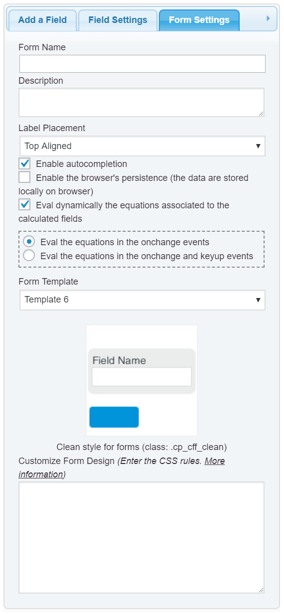
If you want to preserves the columns in all devices, enter the following style definition into the “Customize Form Design” attribute in the “Form Settings” tab (https://cff.dwbooster.com/images/documentation/form-settings-tab.png):
#fbuilder .fields.column2{float:left;width:49.9%;}
#fbuilder .fields.column3{float:left;width:33.3%;}
#fbuilder .fields.column4{float:left;width:24.9%;}
Best regards.
Thanks so much for the quick reply. That code works on all the pages except this one.
While it does break into the columns correctly, the words break up and become illegible when wrapping. Is there are fix to this?
Also all the fields, while in the DIV/fieldset tables, do not seem to align properly. The most obvious ones being the ‘calculate’ and ‘reset’ buttons, despite being in the same multi-column DIV fail to align.
Hello @stratejem,
An alternative would be apply the font size to the labels based on the screen sizes, using for example, the following style definition:
@media screen and (max-width:710px){
#fbuilder label{font-size:12px !important}
}
Best regards.
Hi @codepeople,
Not sure if I’m doing this right but I added that second it of code below the first bit and it fixes the words breaking up mostly. The only thing left is that the calculate button now reads:
calcu
lateSome fields are misaligned due to the difference in length of text labels above, and the buttons are still misaligned.
Any other ideas?
Much thanks!
Hello @stratejem,
In my mobile your form is displaying fine, but if you prefer modify the buttons’ texts too, the style definition would be:
@media screen and (max-width:710px){
#fbuilder [type="button"],
#fbuilder [type="reset"],
#fbuilder label{font-size:12px !important}
}
Best regards.
I can’t thank you enough, @codepeople.
Do I add all 3 bits of code to each form? Or just the last one?
I added all 3 to the ‘Customize Form Design’, and everything looks good… except the buttons still. Also the fields above the buttons are misaligned due to the difference in label length above.
It looks like this on my phone.
Hello @stratejem,
The styles entered into the “Customize Form Design” attribute, affect only to the corresponding form, or the forms in the same page.
If you want this modifications affect to all forms in your website, you can enter the styles definitions into the following menu option on your WordPress: “Appearance > Customize > Additional CSS” (look that this screen includes options for entering the styles definitions based on the screen sizes)

Concerning to the buttons, I recommend you insert a container field (a Div Field) and move the buttons into this container.
Best regards.
Hi @codepeople,
Thanks for the help!
1. Should I insert all 3 pieces of code or just 1 of them?
2. The buttons are already in a DIV field, and separate from the labels above, which is why I’m wondering why they are still misaligned.Thanks!
Hello @stratejem,
The code should be inserted into the section for the screen-size where you want apply the changes.
Concerning to the buttons alignment, the issue is caused by the style definition:
button,
input[type="submit"],
input[type="button"],
.btn {
  position: relative;
  margin: 10px 1px;
  padding: 12px 30px;
  border: none;
  border-radius: 3px;
  white-space: normal;
  letter-spacing: 0;
  text-transform: uppercase;
  will-change: box-shadow,transform;
}
in to the file: “http://bluntrealtor.com/wp-content/themes/hestia/style.css” of the theme active in your website.
There two solutions:
– Include the reset buttons into the previous style definition:
button,
input[type="submit"],
input[type="button"],
input[type="reset"],
.btn {
  position: relative;
  margin: 10px 1px;
  padding: 12px 30px;
  border: none;
  border-radius: 3px;
  white-space: normal;
  letter-spacing: 0;
  text-transform: uppercase;
  will-change: box-shadow,transform;
}
Or you can include the following style definition into the “Customize Form Design” attribute in the “Form Settings” tab.
#fbuilder input[type="button"],
#fbuilder input[type="reset"]{margin:0 !important;}
Best regards.
That fixed it, thanks!
One last question, how do I change the font size for the section break and fieldset header text?
They are breaking up in mobile view, and coming up like:
Monthl
y
Liabiliti
esI’m guessing the only way to fix that is to reduce the font size?
Hello @stratejem,
The solution is always the same, but using as selector:
#fbuilder .section_breaks *@media screen and (max-width:710px;) { #fbuilder .section_breaks *{ font-size:14px !important;} }Best regards.
The topic ‘Format in mobile site’ is closed to new replies.