Hi Yak Chum
Does that mean it is that you want to display as follows?
http://www.tenman.info/wp3/manualraindrops/files/front-portfolio-responsive.jpg
If correct it, Please add the following code to the end of the style.css
@media screen and (max-width : 640px){

    #portfolio ul.index > li{
        width:100%;
        padding-bottom:57.5%;
        margin-bottom:1em;
    }
}
Thank you.
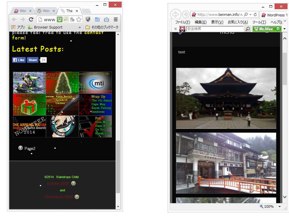
OK i noticed another problem.
The post http://www.theplastichull.net/2014/12/10/jackson-kayak-big-rig-extended-use-review/
In the IE and Chrome Browser it looks like mobile. In firefox it looks like web.
It should look like this.
http://www.theplastichull.net/2014/11/25/great-gifts-under-100-for-a-kayak-angler/
I removed the Code from CSS and no change..
Fixed!! Never mind thank you for the help!!
