Hello @vamtec
The form is responsive by default. The fields are adjusted to the screen size in the small screens (like mobiles), applying 100% to the fields’ widths to prioritize the entry of values.
How exactly do you want to display the form?
Best regards.
Thread Starter
 vamtec
(@vamtec)
I am trying to use the cff-form in the android app. When I open the url in desktop browser, it is responsive. However, when it is opened in mobile browser or within app, it is not responsive. In the mobile, the page is opened full width and it is very difficult to use or enter values in the field.
Is there any css code, where the page becomes responsive with the screen width?
I have some screen shots. Unfortunately, don’t know, how to share here.
-
This reply was modified 5 years, 11 months ago by
 vamtec.
Hello @vamtec
You can define the new styles through the “Customize Form Design” attribute in the “Form Settings” tab:
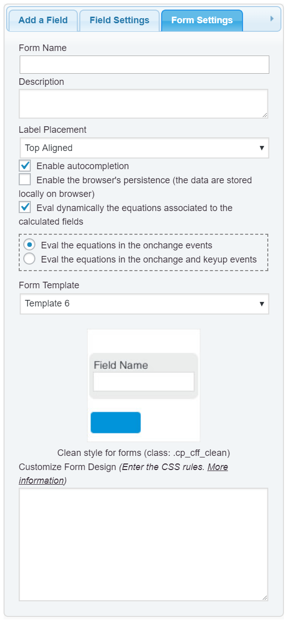
More information about the class names and the structures of the form’s fields, reading the following post in the plugin’s blog:
https://cff.dwbooster.com/blog/2020/01/12/form-design/
Best regards.
Thread Starter
vamtec
(@vamtec)
Thanks for your support.
I have checked the form-design but not getting anywhere.
When I open my form https://www.vamtec.com/?cff-form=1 in a laptop browser, it is responsive.
However, when I open my cff-form https://www.vamtec.com/?cff-form=1 in iPhone (iOS) or samsung (android) browser, it is not responsive. It is displaying the full width of the form with very small text.
How do I make the form mobile friendly?
Hello @vamtec
Please, Install the latest update of the plugin (published right now) and let me know if the issue persists.
Best regards.

