Hi @rachel75,
I need to reproduce the same issue you found. for that, can you please explain in steps how did you add the block?
You may mention what block type(s) did you insert and which styles did you apply.
Here is the URL: https://rachelsruminations.com/heeswijk-castle-den-bosch/ Scroll down and you’ll see the first text box, starting with “Besides my article…”.
The block type is paragraph. Using Editor Plus’s setting, I chose Border, set the size (4) and typed in the color code. That puts the box around the block.
I wanted to make it stand out a bit more, so I chose Box Shadow in Editor Plus’s settings. I chose Outer and set x to 2 and y to 2, blur on 4 and spread on 1. It gives the box a nice shadow in the editor view, but not in the published post. As you can see in the published post, only the lower shadowing shows.
Next I tried to make the box less wide (which I’d like in any case). If I choose Sizing in Editor Plus’s settings, I can change the max width to, say, 85%. The problem is, if I do that, the box stays left-justified, which looks odd. Scroll down to the next text box in the post (Starts with “If you’re planning…”) and you’ll see what I mean.
I’d like to be able to set the max width to 85% and have it a) centered in relation to the blocks below and above and b) adjust accordingly for different size screens. It would have the further effect of showing the shadowing properly (as you can see in that second text box).
I have a feeling there must be some simple way of doing this, but I can’t figure out what it is…
Hi,
Please try the following:
– Add a columns block that consists of 3 columns.
– Add the paragraph in the middle column.
– Select the middle column and set its width to 85%.
– Select the paragraph and set its width to 100%.
I hope that this works for you.
Yes, that’s an improvement. Thank you! If I choose the column layout that has three columns but the middle one is biggest, I don’t seem to need to set the width at 85%. No matter where I set either width or max width – 85% or 100% or don’t set it at all – the column still only takes about 50% of the space. Is there any way to widen the middle column?
Thank you so much for your help! Are you from Editor’s Plus? A great add-on would be some way to make this possible without a work-around like this!
I just realized that on mobile it’s still not quite right. Even if I put either width or max width on 85%, on mobile the column is the same width as the paragraphs above and below it, which means the shadow on the right gets cut off. Somehow it’s less disturbing to me on mobile than on my desktop, but stil, there ought to be some way to make the box a bit less wide than the rest.
Hi,
I made it work on desktop and mobile using a single column.
So, please try the following:
– Add a Columns block that consists of 1 column this time.
– Set the column width to 100%
– Add the paragraph to the column.
– Select the paragraph and set its width to 85%.
No, I’m afraid that isn’t working for me. I can add a columns block with just 1 column and set the column width at 100%. But then after I add a paragraph in, it doesn’t give me the option to set the paragraph’s width. All I see in the menu for the block is typography, color settings, text settings and advanced. Selecting the paragraph doesn’t make a difference: same options.
Hi,
Please try the steps I provided in my last reply and try the following for the paragraph block:
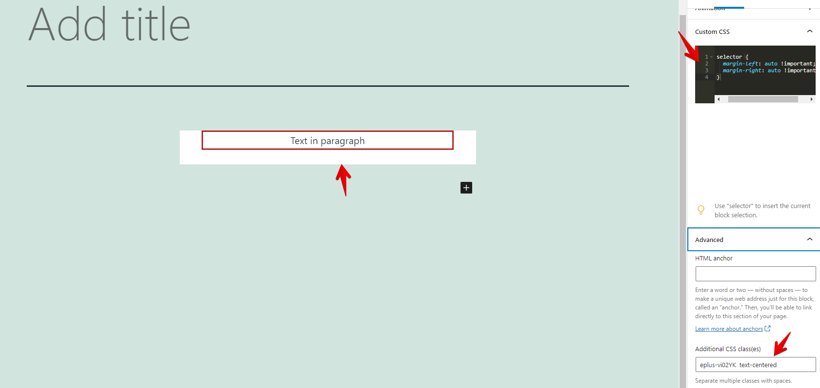
– Add the following CSS in the Custom CSS editor:
selector {
margin-left: auto !important;
margin-right: auto !important;
}
– Add the “text-centered” class without quotes to the “Additional CSS class(es)” in the Advanced settings:
This screenshot describes the above two steps and shows that the block is centered: https://snipboard.io/38a1il.jpg