Error with some screen sizes and css code
-
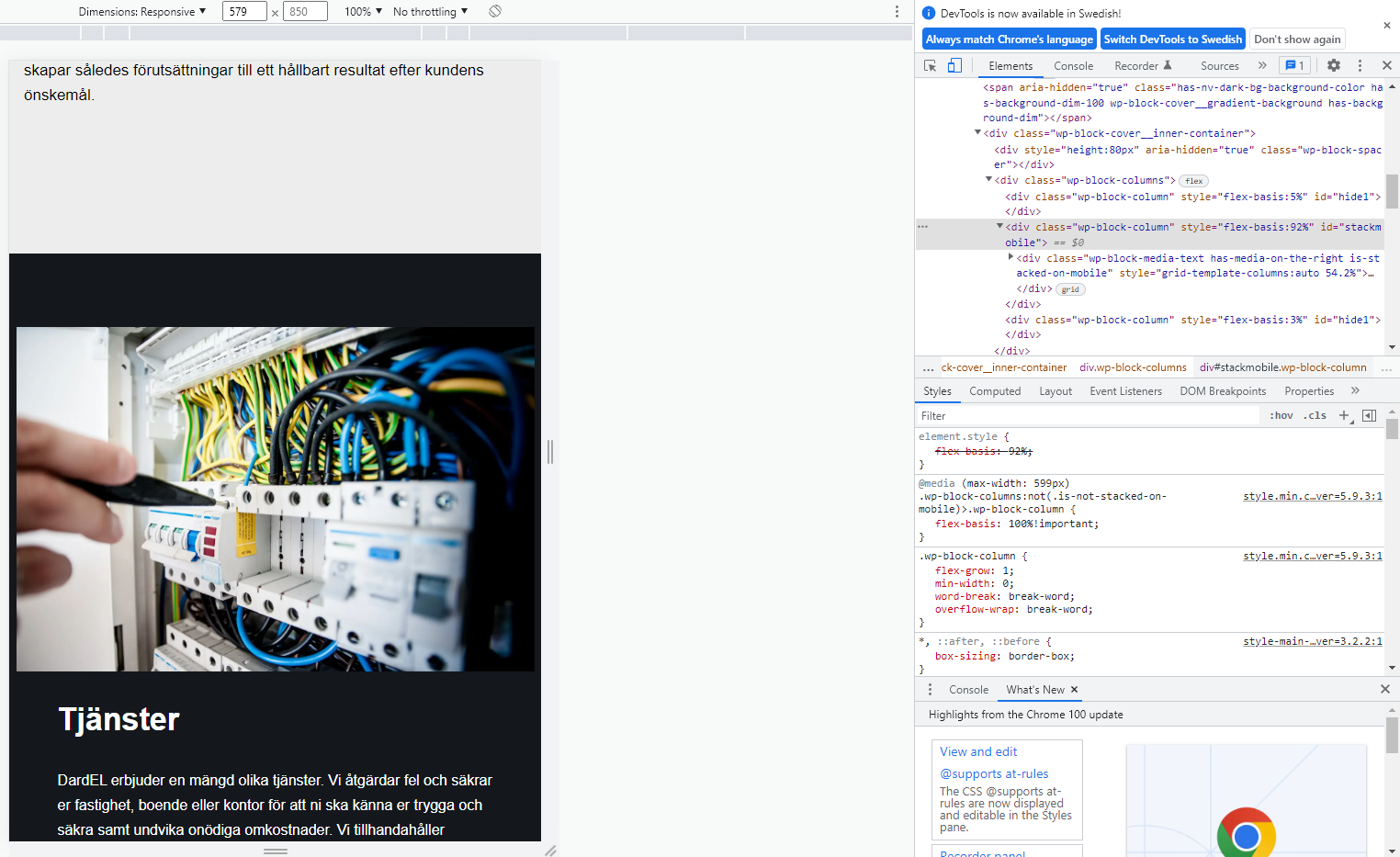
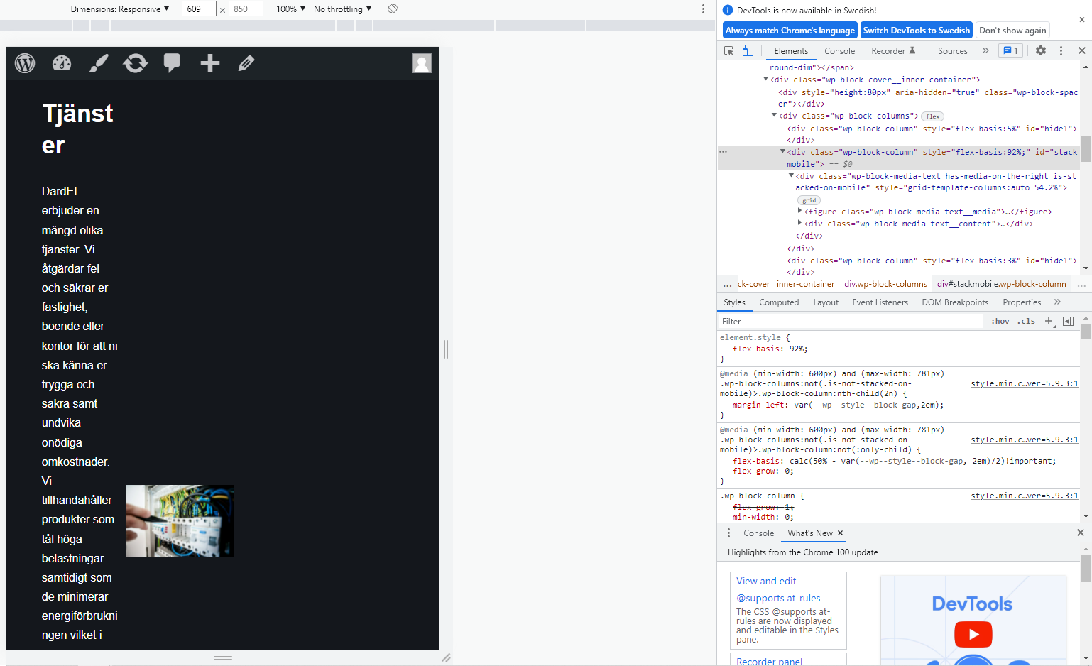
https://i.gyazo.com/c629b575eafa9876d44ddf2e47f24cae.png PHONE
https://i.gyazo.com/6eba93f0a8510b5ef8f0c6ab119eeee5.png IPADSo the problem in the pictures is that when the screen is between 600px and 781px big, the pictures and the text flip out.
My solution for this is to make some css code that does so it looks the same on phone until 781 px big. So I put an ID on the column, there are 3 columns, 2 empty ones because I had a hard time getting the middle part where I wanted it to be.
The empty ones have ID “hide1” and the css code for them are:@media screen and (max-width: 781px) {
#hide1 {
display: none;
}
}
I put this in because I first thought this was the problem, but it didn’t help much.Now Im trying to get css code that will actually help me, I found the stuff in the google chrome inspect element, but have no clue how to make css code for it.
I IDd the column that I want to make the css code in with ID: stackmobile and from the inspection tool I found this code:@media (max-width: 599px)
style.min.c…ver=5.9.3:1
.wp-block-columns:not(.is-not-stacked-on-mobile)>.wp-block-column {
flex-basis: 100%!important;
}This is what I want to put in css format, and upp the max-width to 781px but I dont know how to, unless there is a smarter way, or someone has a better idea.
The flex-basis does not seem to matter too much either.Big thanks for reading this!
-
This topic was modified 4 years, 1 month ago by
. Reason: Moved to Fixing WordPress, this is not an Developing with WordPress topic
The page I need help with: [log in to see the link]
-
This topic was modified 4 years, 1 month ago by


The topic ‘Error with some screen sizes and css code’ is closed to new replies.