format grid
-
Using the responsive grid layout. Here’s the basic code:
<!———————NEW ROW———————>
<div class=”row-fluid”>
<div class=”span4″>
</div>
<div class=”span4″>
</div>
<div class=”span4″>
</div>
</div>
<!——————END OF ROW———————>
with content in each of the 3 <div>My problem: there’s an automatic 30px gutter between the cells, 15px on each side. Does anyone know of a way to reduce or eliminate the gutter? I have three images at the top of this page:
http://richsride.org/frontrangefreedomtour/
I’d like to eliminate the white space between them. Thanks.
-
there is a margin-left on the last two images. so override the fluid width and remove margins.
.row-fluid .span4 {
    width: 33.33333333333% !important;
    margin: 0 !important;
}
i thought you solved this problem yesterday when it was in tables…
I did…but I decided to make a more responsive design.
Thanks for the suggestion. I’ll give it a try.
Worked! Thanks.
Now I’m trying to align the images…just like yesterday.
Can I name a div like I named a table so I can put all the custom css for that row in the child theme?
Wo0uld I use the same css to align the images that I used in the table?
thats a more difficult answer. images, technically, should be properly optimized for their intended location. it can be a task to throw images of all different sizes in equal boxes and get desired results. with that said, in your, case. you can set a defined size on the parent container (smaller, or the same size of your smallest image height) and set it to ‘overflow:hidden’. this will essentially crop the images.
Cropping won’t work for this case.
Is there a way to alingn an image to the bottom of an individual div?
I’ve been studying and trying this:
http://www.w3schools.com/css/css_positioning.asp
but can’t get it to work.
Suggestions?
Hi,
Won’t work like that in a responsive setting. And even raw html 4 doesn’t allow to align images to the bottom of a line, for example.
I think what you need is to make a new div inside your div, or in a raw fashion make an old style table, top of the div.
But it’s difficult to see without a sample code, can you put a sample code to show us please?
<!———————NEW ROW———————>
<div class=”row-fluid”>
<div class=”span4″ id=”imageWrapper” style=”style=”width: 33.33333333333% !important; margin: 0 !important”><img class=”aligncenter id=”bottomImage” wp-image-11573 size-full” src=”http://richsride.org/wp-content/uploads/2015/10/FRFT-UVP-2.jpg” alt=”Hope and Freedom” width=”720″ height=”593″ /></div>
<div class=”span4″ id=”imageWrapper” style=”width: 33.33333333333% !important; margin: 0 !important”><img class=”aligncenter id=”bottomImage” wp-image-11571 size-full” src=”http://richsride.org/wp-content/uploads/2015/10/FRFT-Banner-2016.png” alt=”FRFT 2016″ width=”625″ height=”526″ /></div>
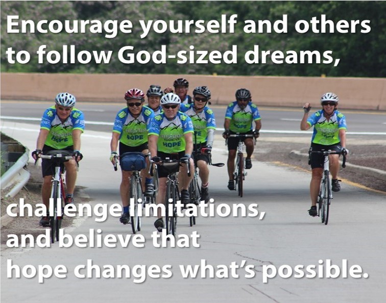
<div class=”span4″ id=”imageWrapper” style=”width: 33.33333333333% !important; margin: 0 !important”><div id=”bottomImage”><img class=”aligncenter wp-image-11572 size-full” src=”http://richsride.org/wp-content/uploads/2015/10/FRFT-UVP-1.jpg” alt=”Hope changes what’s possible” width=”732″ height=”593″/></div></div>
</div>
<!——————END OF ROW———————>#imageWrapper { position: relative; }
#bottomImage { position: absolute; !important
display: block;
bottom: 0; !importantYou can see…I tried the div inside a div method in the third image and it moved the image totally out of line
You shouldnt have more than one element with the same ID. Id’s should be unique and generally only appear on a page once. Assign each of those element s a class name in order to target them in your css.
and yes you can align the images to the bottom, but that will leave the top jagged, just as the bottom is now. if you give each of the elements containing images a relative position, then you can give the images an absolute position and tell them to be at the bottom.
as an example:
.parent-of-image { position: relative; } .parent-of-image img { position: absolute; bottom: 0; }<!---------------------NEW ROW---------------------> <div class="row-fluid"> <div class="span4 holder"> <img class="aligncenter wp-image-11573 size-full" src="http://richsride.org/wp-content/uploads/2015/10/FRFT-UVP-2.jpg" alt="Hope and Freedom" width="720" height="593" /> </div> <div class="span4 holder"> <img class="aligncenter wp-image-11571 size-full" src="http://richsride.org/wp-content/uploads/2015/10/FRFT-Banner-2016.png" alt="FRFT 2016" width="625" height="526" /> </div> <div class="span4 holder"> <img class="aligncenter wp-image-11572 size-full" src="http://richsride.org/wp-content/uploads/2015/10/FRFT-UVP-1.jpg" alt="Hope changes what's possible" width="732" height="593"/> </div> </div> <!------------------END OF ROW--------------------->that syntax was messy. you had multiple same id’s, id’s inside of a class… and inline styles, which should be avoided unless absolutely necessary
Ok sorry, that’s because I didn’t see what was the sample code.
I disagree in approach with Mr Case, because aligning images to the bottom is always fluffy (while doing a design also for mobile devices and tablets).
Not to mention absolute positioning, is bad to start with. But from bottom, it’s in general a nightmare.
Now if your design is only for browser, it’s all ok.
<!---------------------NEW ROW---------------------> <div class="row-fluid"> <div class="span4" id="imageWrapper" style="style="width: 33.33333333333% !important; margin: 0 !important"><img class="aligncenter id="bottomImage" wp-image-11573 size-full" src="http://richsride.org/wp-content/uploads/2015/10/FRFT-UVP-2.jpg" alt="Hope and Freedom" width="720" height="593" /></div> <div class="span4" id="imageWrapper" style="width: 33.33333333333% !important; margin: 0 !important"><img class="aligncenter id="bottomImage" wp-image-11571 size-full" src="http://richsride.org/wp-content/uploads/2015/10/FRFT-Banner-2016.png" alt="FRFT 2016" width="625" height="526" /></div> <div class="span4" id="imageWrapper" style="width: 33.33333333333% !important; margin: 0 !important"><div id="bottomImage"><img class="aligncenter wp-image-11572 size-full" src="http://richsride.org/wp-content/uploads/2015/10/FRFT-UVP-1.jpg" alt="Hope changes what's possible" width="732" height="593"/></div></div> </div> <!------------------END OF ROW--------------------->Thanks, but I’m still confused.
So my css would be:
.img1 {
position: relative;
}.img1 img {
position: absolute;
bottom: o;
}And my html would be
<div id=”img1″>
image details here
</div>And I’d need a set of code for each image. Is that correct?
here is a fiddle explaining the concept
I see what you’re doing, but I still can’t get it to work.
I guess I don’t understand how to reference the images in the css.
If I use
img {
max-width: 100%;
width: 100%;
height: auto;
}won’t that impact every imaage in the document?
Also, I now have the white space again. Is this an un-solvabale problem?
yes. i did that for example only.
and there is no such thin as an unsolvable problem. like i said before though the easiest thing, and in my opinion best thing to do, would be to optimize those images for their intended use. If you know you will have three images next to one another with no border and of equal size, then that’s how they should be created.
an alternative would be like i said to “crop” them. not the images themselves, but rather the overflow of the parent element.
The topic ‘format grid’ is closed to new replies.