Mobile menu issues
-
I am trying to set up the mobile version for my website, but am having problems with the menu on the mobile version.
Firstly the menu button is too close to the header text and I cannot move it down the header or change its position.
When you click on the menu button it amplifies the header picture and the text on the menu is huge. How can I change this?
Thank you,
AmandaThe page I need help with: [log in to see the link]
-
Hello @acrylicpourjewellerystore,
Thanks for reaching out and letting us know.
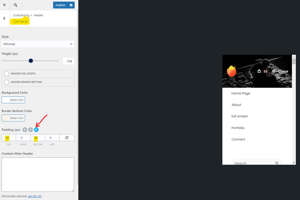
1. Please navigate to Customizing > Header > General; find the padding. Then click on the “Mobile Device” icon and set your desired padding for the header menu; Like this: https://i.postimg.cc/d0XHbmSN/image.png.
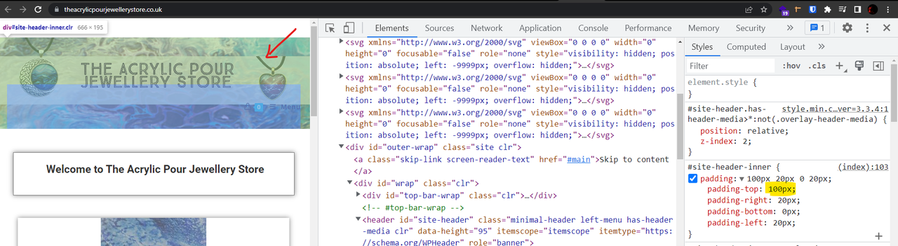
On your website, it has large padding from the top: https://i.postimg.cc/rmN41qWG/image.png.
2. Regarding the header media image, we did see this happening on our end, so we’ll share this topic with the developer team, and it will be improved for the next updates.
Best Regards
Hello,
Thank you for your response.
I have looked at the advice you gave and the padding is already set lower on the mobile device, it is only on pc that it is set high. I wanted the basket and menu to be a little further down.
Is there anything else I can try?
Also, I have updated the theme today and the mobile version is now flashing constantly and will not load anything.the pc version is fine, but the mobile version is terrible, nothing is loading.-
This reply was modified 3 years, 8 months ago by
acrylicpourjewellerystore.
Hello,
Thank you for your response.
I have looked at the advice you gave and the padding is already set lower on the mobile device, it is only on pc that it is set high. I wanted the basket and menu to be a little further down.
Is there anything else I can try?Also, I have updated the theme today and the mobile version is now flashing constantly and will not load anything! the pc version is fine, but the mobile version is terrible, nothing is loading.
-
This reply was modified 3 years, 8 months ago by
Hello @acrylicpourjewellerystore,
Thank you for reaching out,
1. You can set the padding-top for the header: https://postlmg.cc/JyN5JJ8j.
2. Regarding the mobile version, would you please share some screenshots from your issue? I couldn’t open your website. You can upload your files to one of the following online services:
https://postimages.org
https://loom.com
https://drive.google.com
https://wetransfer.com
https://dropbox.comBest Regards
Hi,
1)I have tried changing the padding on the mobile version, but the menu does not move any further down. How do I remove the menu from the header and show it underneath the header instead?
2)The issues regarding the mobile version- I have restored my website to before the update and the issues no longer exist. I realise this is not a permanent solution, but it is impossible for users to use the website with the current update in place. It simply will not load and is flashing constantly.
Regards,
AmandaHello @acrylicpourjewellerystore,
Thank you for reaching out,
1. Do you mean the “menu” text? Or the whole of the menu?If you mean the text, we don’t have an option for it, but you can use the custom CSS. Please put the CSS below in Customizing > Custom CSS/JS > CSS Code:
.mobile-menu {
    padding-top: 40px !important;
    line-height: 1 !important;
    text-align: center !important;
}

.mobile-menu i {
    display: block !important;
    line-height: 1 !important;
}
For more information about the CSS/JS code on the customizer, please read this link:
https://docs.oceanwp.org/article/354-add-custom-css-and-js-to-your-website.Result: https://i.postimg.cc/6qkYjjLD/image.png.
2. Sorry, but the issue is unclear to me. Would you please share a short video from your issue?
Perhaps, it’s a conflict, so for troubleshooting, please do the following steps and let me know the results:
1- Head over to WP Dashboard > Plugin.
2- Deactivate all plugins.
3- Then, first activate the Ocean Extra plugin.
4- Check your issue.
5- Then, activate your plugins one by one
6- After activation of any plugins, check your issueNote: if you have any cache plugin or server cache(CDN / Browser Cache and Cookies and …), you need to clear its cache contents or disable them to see your changes. Also, don’t forget to click on the regenerate all assets file and data in Elementor > Tools.
Best Regards
Hi,
Thank you for your response.
1) I meant move the whole menu so it is no longer in the header and appears underneath the header. how would I do this?
2) thank you I will try the troubleshooting and let you know how I get on.
Regards,
AmandaHello @acrylicpourjewellerystore,
I’m afraid that’s not possible in this header.
To achieve it, you can use the custom header. Please follow the steps explained in this link: https://docs.oceanwp.org/article/355-how-to-create-a-custom-header.Best Regards
Hi,
So, the only place the menu can appear with this theme is in the header?
I just want to move the menu underneath the header, so it is no longer a part of the header, as is common with most other themes.
Regards,
AmandaHi Again,
The standard header should have a menu, and it can’t be out of the header. With your current website header, it’s not possible to set it out of the header, but you can use the custom header.
Best Regards
-
This reply was modified 3 years, 8 months ago by
The topic ‘Mobile menu issues’ is closed to new replies.
