• Resolved jimithing007

    (@jimithing007)


    Hi! Love the plug-in, been using it for a while now. I just have a slight lingering issue and was hoping for some advice.

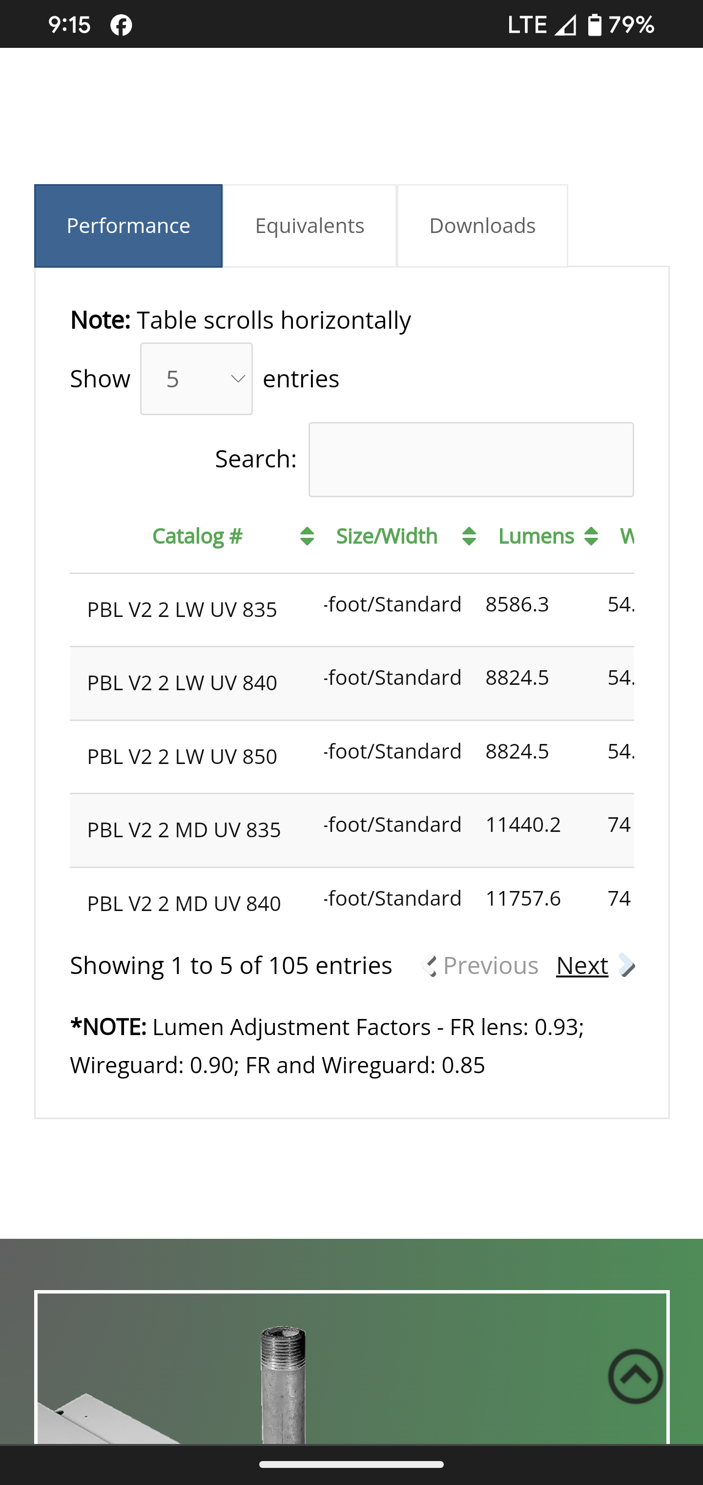
    I’m running into an issue where tables look great on desktop, but sometimes information is getting cut off on the mobile version. This is typically happening in the second column (see screenshot here).

    I am using the following extensions: Column Filter, FixedColumns, FixedHeader.

    I try to play around with text size and column width to get it to a state that looks good on both the desktop and mobile versions, but it’s an ongoing struggle. Today I tried using the padding CSS in addition to the column width, but didn’t have much luck there either.

    This particular table can be found on this page: https://lumenfocus.com/PBLHD/

    I currently have this code applied:

    .tablepress-id-83 .column-1 {
    width: 200px !important;
    }

    .tablepress-id-83 .column-1 {
    padding: 10px;
    }

    .tablepress-id-83 .column-2 {
    padding: 10px;
    }

    .tablepress-id-83 .column-8 {
    white-space: nowrap !important;
    }

    Any advice you have is much appreciated. Thanks!

    The page I need help with: [log in to see the link]

Viewing 5 replies - 1 through 5 (of 5 total)
  • Plugin Author Tobias Bäthge

    (@tobiasbg)

    Hi,

    thanks for your post, and sorry for the trouble.

    Playing around with widths and padding will likely not really get you anywhere. There are so many different screen sizes of phones that it simply can’t work everywhere.

    Instead, I recommend looking into an approach for responsiveness of tables, where the table display is changed to a different layout, for example. This is e.g. possible with the Responsive Tables feature module that is part of the TablePress premium versions.

    By the way: These also have the TablePress Extensions that you mention (which are now retired and won’t receive further updates) directly built-in, with many improvements and direct integration into the user interface — which means no more dealing with error-prone Shortcode parameters.

    Best wishes,
    Tobias

    Thread Starter jimithing007

    (@jimithing007)

    Thanks for the info and the quick response Tobias!

    A couple of questions: 1) do you foresee any issues if we continue using the extensions moving forward being that there will be no more updates? and 2) If we upgraded to the premium version, how difficult of a transition would it be from what we’re using now? I have a ton of tables already built on the site. Would they need to all be rebuilt, or would they carry over with minimal rework?

    Plugin Author Tobias Bäthge

    (@tobiasbg)

    Hi,

    sure, no problem!

    No, I don’t foresee issue when continuing using the existing Extensions. Their code is not overly complex (as they mainly reuse stuff in TablePress) and I will not be “breaking” them on purpose or anything like that! Of course, I can’t tell if WordPress changes in the future could have an influence, and they won’t benefit from enhancements in TablePress.

    The transition to a premium version would be very easy and straightforward! All existing tables, settings, etc. will continue to work without any changes being necessary! You will just benefit from the additional premium features and their integration into the user interface right away. As a benefit, you can even do the transition from the existing Extensions to the corresponding premium feature whenever you are ready!

    Best wishes,
    Tobias

    Thread Starter jimithing007

    (@jimithing007)

    Great information. Thank you Tobias!

    Plugin Author Tobias Bäthge

    (@tobiasbg)

    Hi,

    no problem, you are very welcome! 🙂 Good to hear that this helped!

    Best wishes,
    Tobias

    P.S.: In case you haven’t, please rate TablePress here in the plugin directory. Thanks!

Viewing 5 replies - 1 through 5 (of 5 total)

The topic ‘Mobile table spacing recommendations’ is closed to new replies.