Please specify, what “good display” means. What happened when “button” was used instead of “a”?
Thread Starter
 vent
vent
(@ventair)
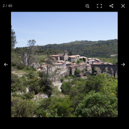
For a better understanding, here are screenshots:
Good Display with “a” or “compatible theme”
too many icons at top bar with Hamilton theme
bad shadow on mouse over “next” or prev” with Oria theme
-
This reply was modified 8 years, 3 months ago by
 vent.
vent.
Thanks for the screenshots.
It seems there is a problem with CSS rules which define styles for “button” elements which don’t get replaced by the PhotoSwipe UI styles. I’ll fix that.
Thread Starter
vent
(@ventair)
OK,
All works good! With my two themes!
Thanks
but I found another problem with two new themes by Anders Norén! (I created a new topic)
Unfortunately this introduced a new problem:
Some browsers have a problem, if the UI elements are not button – e.g. Firefox for Android. Also a is not working properly. That’s the reason, why button was used originally by PhotoSwipe.
This leads to the situation, that the “fullscreen” button does not work in Firefox for Android when using div and when using a it seems to work but then also “zoom” will triggered as well.
I’ll have to sort this out for the next update.
Thread Starter
vent
(@ventair)
I haven’t smartphone or tablet to test Android or IOS…
My idea to replace ‘button’ with ‘a’ comes from this plugin: Easy Photography Portfolio
You can simply test the rendering with both test sites:
http://default.portfolio.bycolormelon.com/portfolio/colors-and-patterns/
http://befree.bycolormelon.com/portfolio/darte-shop/
I look quickly in the css themes!
Thread Starter
vent
(@ventair)
For Hamilton, here is the css problematic, with my knowledge, I did not find the line involved:
button,
.button,
input[type="button"],
input[type="submit"] {
	background: #000;
    border: none;
	border-radius: 0;
    color: #fff;
    display: inline-block;
	font-family: inherit;
	font-size: 16px;
	font-weight: 700;
	min-width: 120px;
    padding: 16px 24px 18px;
	text-align: center;
	-moz-appearance: none;
	-webkit-appearance: none;
}

button,
.button,
input[type="button"]:hover,
input[type="submit"]:hover {
	cursor: pointer;
}

.dark-mode button,
.dark-mode .button,
.dark-mode input[type="button"],
.dark-mode input[type="submit"] {
	background: rgba( 255, 255, 255, .25 );
	transition: background .2s ease-in-out;
}

.dark-mode button:hover,
.dark-mode .button:hover,
.dark-mode input[type="button"]:hover,
.dark-mode input[type="submit"]:hover {
	background: rgba( 255, 255, 255, .3 );
}
with dark-mode, rendering is different (screen capture with 1.7 version, works good with 1.9): exemple-dark-mode
-
This reply was modified 8 years, 3 months ago by vent.
Thread Starter
vent
(@ventair)
The css overwrite Photoswipe button for Oria:
button:hover,
.button:hover,
input[type="button"]:hover,
input[type="reset"]:hover,
input[type="submit"]:hover {
	background-color: #17191B;
	color: #fff;
	text-decoration: none;
}
button:focus,
input[type="button"]:focus,
input[type="reset"]:focus,
input[type="submit"]:focus,
button:active,
input[type="button"]:active,
input[type="reset"]:active,
input[type="submit"]:active {
	border-color: #aaa #bbb #bbb;
	box-shadow: inset 0 -1px 0 rgba(255, 255, 255, 0.5), inset 0 2px 5px rgba(0, 0, 0, 0.15);
}
I finally found the missing CSS rules to make sure, that button elements displayed properly as well even in Hamilton in Oria. The next update will contain the fixes.
Thread Starter
vent
(@ventair)
All works good,
without this little problems, this plugin is really in the top of free lightbox for WordPress!