I am trying to build a website and customizing the layout at the moment. I have noticed every time I change the layout for desktop, it also changes to mobile. Am I missing something?
The page I need help with: [log in to see the link]
Thanks for reaching out! Could you please specify how you have set the layout settings for mobile? Also, which block are you customizing, and where exactly are you making these changes? If possible, sharing a screenshot of the settings would help us better understand the issue.
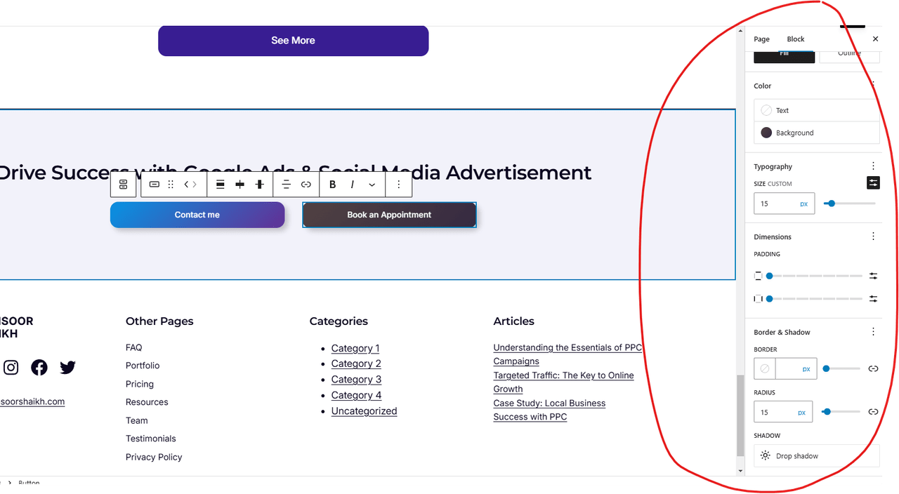
Ideally how responsive design should work is to show every column in below each other. For example these side by side buttons. See the screenshot. If I change the size for example, it will change it to all devices and I don’t see any separate option for mobile.
This reply was modified 1 year, 3 months ago by imansoor.
Thanks for sharing the details! The WordPress block editor doesn’t provide separate style options for mobile styling
If I understand correctly, you want the buttons to stack on mobile, right? You can achieve this by selecting the parent Columns block, then look for the “Stack on mobile” option and toggle it on.
You can simply toggle on the “Allow to wrap to multiple lines” option so that when there isn’t enough space, the second button automatically wraps onto a new line.
Viewing 5 replies - 1 through 5 (of 5 total)
The topic ‘Responsive Design Not Working’ is closed to new replies.


